
TAMARA HESSE
Zeit
Responsive website design
Role
UX/UI Designer, Corporate Branding
Duration
6 weeks
Client
Zeit is a travel agency selling time travel vacation packages to 289 destinations from the prehistoric to the modern age. Not only is Zeit a new brand but it is selling a product that has never been sold before.
Challenge
Determine interest in new brand, concept. Then identify competition, target market and assess what a user would need or want to complete an online booking process.
Result
Through my research, design, and testing, I designed an easy to navigate website that provides enough information, for a user to be able to identify, research, select, and book a time travel vacation package, while feeling safe and supported, and most importantly excited about their trip!
Project completed in practicum for DesignLab UX Academy

_edited.jpg)
.png)
Let's focus on the users. What are they travelling for? Who do they want to see? Where do they want to go? How they prefer to get there and why?
Research
I focused on user travel habits and motivations as the basis for all my research. I was less interested in competitors, because there are no apples to apples competitors. I wanted to know what users travel for, who they want to see, where they prefer to go, how they prefer to get there and why.
Secondary research was conducted to get some statistical data regarding the previous years data.
1:1 User interviews were then used to define our target market and determine what information would be required for the user to feel comfortable with the booking process.
Finally, Due to the large number of destinations and their span across space and time, It was necessary to conduct a card sort study to determine the best way to categorize these destinations.
Key Takeaways

*Notice most commonly grouped destinations in the card sort are from the last 2 centuries, unless its an ancient civilization like Rome or Egypt.
-
Enriching experiences such as experiencing different cultures, and visiting unique and beautiful places are a must for most travelers.
-
Users need to feel safe, in control and protected when they travel.
-
Most users want to use time travel to visit loved ones or relive past experiences.
-
The user needs to feel as though they are receiving a benefit for their paying for the trip. The greater the value, the more they are willing to pay.
Travelers love exploring different cultures, their history and seeing unique places. As long as its safe, they're in control, and its a good value.
Meet Steve!
I developed a persona named Steve. Steve is a married, 70 year old who is loving retired life and is fully open to new experiences - as long as it's nothing too crazy. With Steve’s feedback, I designed a flow that would provide the maximum amount of information that a time traveler may require, in a clear and expedited manner, with the addition of real time customer assistance. Through the wireframing and prototyping process, I gathered user feedback to refine the destination research process, to account creation, to booking and confirmation.

"There is no single right answer or path forward, but there is one right way to frame a problem." - Clayton Christensen
Zeit Site Map

Steve's Booking Task Flow

Lo-Fi Wireframes
.png)


"Every great design begins with an even better story." - Lorinda Mamo
Branding
Zeit's branding is a modern representation of a company moving technology forward, to travel into the past. The stylized Z that's present in the logo and throughout the website, symbolizes directional arrows into the past and future. The negative space is used in the middle of the logo to hint at a path to a destination.
The deep purple color is meant to make users feel that this is a futuristic, cutting edge type product. The blue-ish gray serves as a nice neutral that also is meant to calm the user and help to reassure users of the safety and legitimacy of the company.

Responsive High Fidelity Wireframes


"Nothing is ever so good that it can't stand a little revision."
- Rebecca Solnit
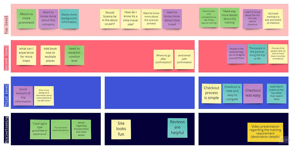
Usability Testing
Objectives
-
Observe first impressions of the site
-
Determine if the user can follow the task flow to book a trip.
-
Determine what might be missing that could enhance usability
-
Assess user pain points.
Methods
-
In-person testing with audio recording
-
Remote testing via Google Meet, screen sharing and audio recording.
Results/ Revisions
-
Simplified navigation to reduce confusion.
-
Added more information to the about us section, as well as information and videos on the landing page regarding safety, risks, ethics, and process of time travel.
-
Added more imagery of people taking part in activities as opposed to landscapes as that excited users more that they would enjoy the destination.
Back to top
See More Case Studies
