Bhuku
End-to-End IOS App
Role
UX/UI Designer, Corporate Branding
Duration
2 weeks
Client
Bhuku is an app for book lovers that will help users track the books they own, are reading, and what they will read next. Additionally, users will be able to rate and share books, author information, even quotes from books.
Challenge
Design a user-friendly, fresh and clean design for Bhuku, by identifying the competition, interviewing the target market and assessing what a user would need, or want in a book inventory application. Additionally, identify ways to integrate mobile device features such as the camera to capitalize on automations such as optical character recognition (OCR) to quickly identify and classify titles.
Result
Through my research, design, and testing, I designed a easy to navigate application that will serve as a valuable and enjoyable tool for readers of all ages and reading intensities.
Project completed in practicum for DesignLab UX Academy

Bhuku helps book lovers catalog the books they own, are reading, and want to read, all while sharing their love for books with their friends.
Research
The research for this project focused primarily on determining the target market for Bhuku is, defining what features to capitalize on to differentiate Bhuku from its competition, and how to best organize the app for optimal user enjoyment.
Secondary research was conducted to determine Bhuku's competition, target market and services offered.
1:1 User interviews were then used to further define our target market and determine what features they would like to see on an app such as Bhuku.
Key Takeaways
-
There are several book inventory apps available, most of which do the same thing as Bhuku. The most popular of which is Goodreads.com, which is partnered with Amazon.
-
None of the readers interviewed use a book inventory service. However, they all said they would use a service like Bhuku if it was easy and beneficial to them in some way.
-
Younger readers are more interested than older readers in the advanced technologies that Bhuku is considering implementing.
-
All readers interviewed still prefer actual books as opposed to audible or e-books.
-
If users are to use a service like Bhuku, they would prefer it be connected to an e-commerce platform where they could purchase the book.
Users would prefer to use a book inventory service that is connected to an e-commerce platform, where they could purchase recommended titles.
Meet Harper!
Harper is an 11 year old student from Atlanta, Georgia that loves to read, play video games, and hang out with friends. She is also the persona I created for this project. Harper is a great persona for Bhuku not only because Bhuku is interested in creating a more tech-savvy app, which is often more appealing to a younger audience, but also because Harper will push Bhuku to focus on the value that the app will provide. Harper's reading habits are heavily influenced by friends, her parents, and even the school librarian, which makes the social aspects of Bhuku a benefit to her.
%20(1)_edited.jpg)
"It would be cool if my school librarian could recommend books for me on an app - like her recommended books table at school." - Harper
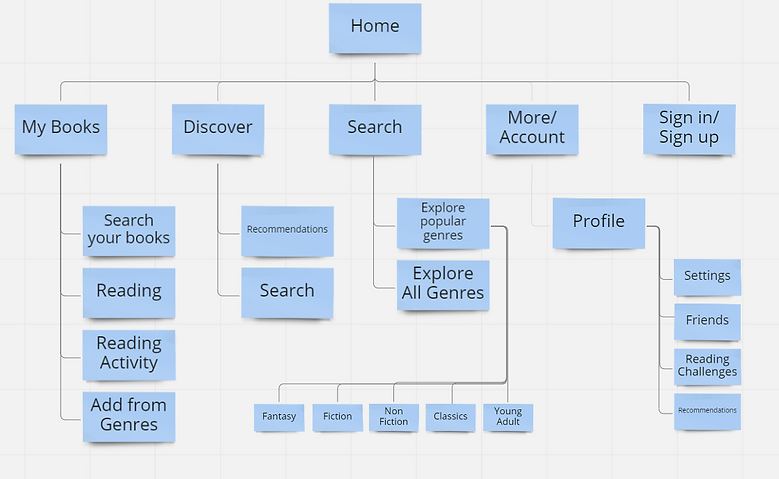
Bhuku Site Map

Task Flow

"Rule of thumb for UX: More options, more problems." - Scott Belsky
Lo-Fi Wireframes


"Every great design begins with an even better story." - Lorinda Mamo
Branding
Bhuku asked for a user-friendly, fresh, and clean design. I began with the logo design, and came up with a stack of books that also looks like a B. I wanted a simple and clean look that can be translated in numerous sizes and applications. The font selections are clear and modern san serifs, and the iconography is clear and concise.
Because Bhuku is essentially an online library, I took inspiration from several images of libraries and books. I wanted the color palette to take a more modern twist on the traditional browns, tans, and navy's found in so many libraries. I chose the deep purple to speak to Bhuku's more modern and technical approach to the book inventory concept. The mustard-y yellow provides a bright and friendly hue that is meant to engage the user, and finally the orange-y red provides a great pop of color to provide the user with direction through action.
Overall, the user testing provided positive feedback regarding the branding and overall UI of the app.
.png)
.png)
"UI is the saddle, the stirrups, & the reins. UX is the feeling you get being able to ride the horse." - Dain Miller
Responsive High Fidelity Wireframes


"Design isn't finished until somebody is using it." - Brenda Laurel
Usability Testing
Objectives
-
Observe first impressions of the site
-
Determine if the user can follow the task flow.
-
Assess whether there are features that are missing that may enhance usability and overall experience.
-
Assess user pain points.
Methods
-
In-person testing with audio & visual recording
Results/ Revisions
-
All of the users were able to efficiently complete the tasks assigned.
-
Category accordion menu's were replaced with icons.
-
Decreased the amount of text and worked more to provide direction as opposed to explanation.
-
Clarify hierarchy throughout.
Iterations/ Hindsight
-
I would have developed this further to include an e-commerce option to purchase a title.
-
I would like to try simplifying the color palette. The colors are all very bold and I wonder if I focused on just one pop of color, it might have a more calming presence.
-
I would like to do more research to determine more ways the users device could be integrated into the app.

